
10 Best Web Design Tips for a Stunning & User-Friendly Website
- Davydov Consulting

- Sep 2, 2025
- 9 min read
Updated: Oct 2, 2025

Studies show that users form an opinion about a website within the first few seconds, which means your design can either attract or drive away potential clients. A great web design blends aesthetics with functionality, ensuring that visitors enjoy not only how the site looks but also how it works. Beautiful visuals may create a strong first impression, but they must be supported by a logical structure and smooth interactions that allow users to achieve their goals without frustration. This article explores 10 practical and research-backed web design tips that will help you create a website that is both stunning and user-friendly.
1. Start with UX Research as Your Foundation

Every successful web design project begins with research. UX research provides valuable insights into how users think, behave, and interact with websites, and without it, design becomes a guessing game. Primary research methods such as interviews, surveys, and usability studies allow you to gather direct feedback from real users. Secondary research, such as competitor analysis and industry benchmarking, helps identify best practices and gaps in the market. By combining these approaches, designers ensure that websites are built with real data rather than assumptions, leading to solutions that truly address user needs.
For example, an online retail business that interviews customers may discover that the checkout process feels overly complicated. By simplifying the steps and reducing form fields, they can dramatically improve conversion rates. Similarly, a company analyzing competitors might find that many industry websites lack accessibility features, giving them an opportunity to differentiate by prioritizing inclusive design. When research is at the foundation, design choices are more likely to succeed. Skipping this stage often results in designs that look appealing but fail to solve business or user problems.
Actionable steps:
Conduct surveys and interviews to understand user needs.
Use analytics and heatmaps to study how users behave on current or competitor websites.
Translate research findings into clear design requirements before moving to visuals.
2. Follow Core UX Laws and Principles

Effective web design is not just about creativity—it is about psychology and human behavior. UX laws provide a framework for understanding how users perceive, process, and interact with digital content. For instance, Hick’s Law states that the more choices you present to users, the longer it takes for them to decide, which is why keeping navigation and options simple is essential. Fitts’s Law emphasizes that the time required to reach a target (such as a button or link) depends on its size and distance, which is why small, hard-to-click elements create friction. Similarly, Jakob’s Law explains that users expect your website to work like other sites they are familiar with, which is why following conventions often improves usability.
These principles highlight that design is not just about making things attractive, but also about making them work seamlessly with how people naturally interact. For example, an e-commerce website that follows Hick’s Law by grouping related products into a few broad categories makes shopping easier for customers. A web application that applies Fitts’s Law by using larger and well-positioned call-to-action buttons encourages more interaction. By consistently applying UX laws, websites feel intuitive even on the first visit, which increases user satisfaction and reduces learning curves. Ignoring these principles, on the other hand, can result in confusion, frustration, and higher bounce rates.
Actionable steps:
Study UX laws such as Hick’s Law, Fitts’s Law, and Jakob’s Law to guide design decisions.
Prioritize usability and clarity when choosing layouts or interactions.
Test whether each new design feature makes the site easier or harder to use.
3. Design Clear and Logical Navigation

Navigation is the roadmap of your website, and without a clear structure, even the most beautiful design fails to deliver value. Users come to your site with specific goals in mind, and if they cannot find what they are looking for quickly, they are likely to leave. Clear and logical navigation ensures that visitors can move effortlessly from one section to another without feeling lost. This becomes especially important in large and complex websites such as online marketplaces, directories, or corporate platforms. Navigation should be designed with the user journey in mind, making it easy for both first-time visitors and returning users to access important content.
Take Amazon as an example. Although it offers millions of products across countless categories, its navigation system is designed to be both comprehensive and usable. Categories are grouped logically, search functionality is prominent, and filters help narrow down options efficiently. This is why an Amazon Design Agency can help you navigate every choice. By contrast, many small businesses neglect deeper levels of navigation, focusing only on the homepage and first-level menus, which often leaves users stranded when they dive deeper into the site. A website that prioritizes logical navigation not only improves usability but also boosts SEO, since clear structures help search engines crawl and index content effectively.
Actionable steps:
Limit primary navigation to five to seven main items for simplicity.
Use clear labels instead of jargon (e.g., “Pricing” instead of “Solutions”).
Add breadcrumbs for multi-level sites so users always know where they are.
Test navigation with real users to identify confusing areas.
4. Stick to Familiar Design Patterns
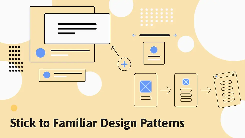
While innovation in design is valuable, it should not come at the expense of usability. Users have mental models and expectations shaped by years of interacting with other websites. When your website aligns with these familiar patterns, users feel comfortable and can navigate with ease. Breaking away from these patterns without strong justification often causes confusion and leads to higher bounce rates. For this reason, it is better to improve upon what users already know rather than reinventing established conventions.
Steve Krug’s book “Don’t Make Me Think” remains a classic in UX design because it emphasizes the importance of intuitive interfaces. When users visit a website, they should not have to pause and figure out how basic interactions work. For instance, a magnifying glass icon universally represents search, and a shopping cart icon represents the checkout function. Changing these symbols to something unusual may seem creative, but it will likely frustrate users who simply want to complete their tasks quickly. In web design, familiarity is often more powerful than novelty.
Actionable steps:
Use standard layouts for headers, footers, and menus.
Stick to widely recognized icons and interaction patterns.
Innovate only when it adds real value, not just for uniqueness.
5. Test, Measure, and Improve Constantly

Web design is not a one-time task—it is a continuous process of testing and refinement. Once a site is launched, it is important to monitor how users actually interact with it. This helps identify weak points, bottlenecks, and areas of improvement. Testing methods such as moderated usability testing, unmoderated remote testing, and A/B experiments provide valuable feedback. Without these iterative improvements, websites risk becoming outdated or ineffective over time.
Consider an online subscription service that experiences a high drop-off rate during the checkout process. By running an A/B test, the team discovers that a simplified form with fewer fields significantly reduces abandonment and boosts sign-ups. Another example is a news platform using heatmaps to see where users stop scrolling, which helps them restructure content placement for better engagement. Testing not only improves usability but also provides measurable results that justify design decisions. The best websites evolve continuously, adapting to user behavior and market demands.
Actionable steps:
Run usability tests during and after development to identify pain points.
Monitor analytics to track bounce rates, time on page, and conversions.
Use A/B testing to validate which design changes work best.
6. Prioritize Consistency and Visual Clarity

Consistency in design is essential for building trust and improving usability. A consistent website feels professional, polished, and easy to navigate because users always know what to expect. Visual clarity, on the other hand, ensures that each element is distinct and contributes to the overall message of the page. When typography, buttons, icons, and layouts vary too much, users become disoriented and perceive the site as untrustworthy. By keeping elements consistent and clean, you create a seamless and user-friendly experience.
For example, Google’s Material Design framework standardizes UI elements across apps and websites, making interactions predictable and intuitive. On the other hand, websites that lack consistency often frustrate users. Imagine filling out a form where the “Submit” button looks different on each page—it creates unnecessary hesitation. Similarly, border radiuses, color schemes, and spacing should remain uniform across a site to reinforce branding and usability. Alongside these visual rules, using Nielsen’s 10 Usability Heuristics as a checklist helps evaluate interaction quality and ensures a logical flow from macro-layouts to micro-details.
Actionable steps:
Ensure typography, button styles, and spacing remain consistent.
Begin with a style guide or UI kit; for large projects evolve into a design system.
Use Nielsen’s 10 Usability Heuristics as a practical checklist to maintain clarity.
7. Use High-Quality Visuals (But Wisely)

Visuals are a powerful tool for storytelling, but they can also harm credibility if used poorly. High-quality images, videos, and illustrations elevate the overall perception of your brand. Low-resolution or generic stock photos, on the other hand, make a website appear unprofessional. The goal is to use visuals strategically so that they support the content rather than distract from it. Every image should serve a purpose, whether it is to explain a concept, highlight a product, or evoke an emotion.
It is also important to avoid overloading the website with unnecessary media. Heavy visuals not only clutter the design but also slow down page loading speed, which negatively impacts SEO and user experience. For instance, an online portfolio benefits from crisp, professional photography that reflects the designer’s skills, while an e-commerce site must ensure that product images are sharp, consistent, and optimized for fast loading. AI-generated visuals can be useful, but relying too heavily on them often results in generic designs that lack personality. Balance and moderation are key.
Actionable steps:
Invest in professional photography or high-quality licensed images.
Optimize images for faster loading without losing quality.
Balance visuals with whitespace for a clean and professional look.
8. Keep Animations Simple and Purposeful

Animations bring interactivity and life to websites, but they should be used sparingly. Over-the-top animations might impress at first glance, but they often slow down performance and distract from core content. Instead, focus on micro-animations that make interactions smoother and more engaging. For example, a button that changes color slightly when hovered over reassures users that the element is clickable. Small, thoughtful animations enhance usability far more than flashy, unnecessary ones.
Micro-animations are particularly effective because they provide feedback. A progress indicator showing that a form is loading keeps users informed, reducing frustration. Contrast this with full-screen animations that delay content visibility, which usually frustrates visitors. While “wow” animations can sometimes fit marketing websites that aim to impress, most businesses benefit from prioritizing function over flair. In short, minimalism with purposeful interaction creates better long-term usability than short-lived trends.
Actionable steps:
Use animations to enhance usability, not to distract.
Keep animation duration short and subtle.
Focus on micro-interactions like hover states, confirmations, and loaders.
9. Design with Accessibility and Readability in Mind

Accessibility is not optional—it is a requirement if you want to reach the widest possible audience. Websites should be usable by people with disabilities, as well as easy to read for all types of users. Good readability ensures that visitors can consume content without strain, while accessibility ensures inclusivity. These principles not only improve user experience but also align with legal standards such as WCAG compliance.
For instance, ensuring strong color contrast makes text easier to read for users with visual impairments. Providing alternative text for images helps screen readers describe visual content to blind users. Clear font choices, short paragraphs, and structured headings make reading smoother for everyone. A website that prioritizes accessibility not only serves a moral responsibility but also benefits from better SEO performance. Inclusive design builds trust and ensures no potential customer is excluded.
Actionable steps:
Use tools like the WAVE Accessibility Tool to check compliance.
Follow WCAG guidelines to ensure inclusivity.
Test your website with screen readers and different devices.
10. Use AI and Analytics Smartly to Support Design

Artificial Intelligence is transforming the design industry, offering new ways to speed up workflows and make data-driven decisions. However, AI should complement human creativity, not replace it. It can be used for repetitive tasks like resizing images, generating layout ideas, or analyzing user behavior, freeing up designers to focus on strategy and innovation. Analytics, on the other hand, provides measurable insights into how users actually interact with your site. Together, AI and analytics help refine design in ways that guesswork never could.
At the same time, it is important not to over-rely on AI-generated visuals or layouts, which often lack uniqueness and personality. The best approach is to combine AI efficiency with human judgment and creativity. For instance, AI tools might generate wireframes quickly, but designers must adapt them to match business goals and brand identity. By pairing these technologies with real user research, websites can be both efficient to produce and deeply effective for end-users. Ultimately, every design decision should be supported by research, analytics, or business needs, rather than aesthetics alone.
Actionable steps:
Use AI tools to save time on repetitive design tasks.
Validate AI suggestions with analytics and real-world testing.
Balance creativity with data-driven decision-making.
Final verdict
Building a stunning and user-friendly website requires a combination of science, creativity, and strategy. From starting with UX research to applying psychological laws, clear navigation, and consistency, every step should be rooted in making the site intuitive and accessible. High-quality visuals, purposeful animations, and inclusive design further enhance user satisfaction. Meanwhile, continuous testing and the smart use of AI and analytics ensure that the website remains effective and relevant over time.


Comments